6 Instructional Design Tips For Effective eLearning

Education is forever changed and will never return to pre-Covid-19 days. Educators are under pressure to develop engaging, motivational, and cross-functional learning experiences for face-to-face and virtual learning. Achieving teacher, social and cognitive presence to keep educators, learners and workers connected and engaged in an online environment can be challenging. Often learners cite that online learning can be tiresome, repetitive, and (let’s be honest) boring!
However, it’s possible to create stimulating eLearning courses that won’t require a visual designer’s help to make an impactful ed-tech course.
Join us to explore six instructional design tips that will enable you to create effective eLearning course pages without formal training in visual design or HTML/CSS coding skills.

Tip #1 Use Meaningful Imagery that relates to your learner’s
Humans are visual beings. We consider expressions, colours and symbols and make a personal conclusion regarding meaning. Adding images to your learning content can boost learner engagement and foster increased emotional impact. Adding the right image can support readers to retain information seven times more than usual.
To ensure you add meaningful imagery that hits the spot with your learners, we recommend:
- A series of images instead of bullet points to present a list-type of content
- Considering the use of photographs instead of clip art to make your course design more professional
- The use of powerful images that evoke the right emotions, particularly positive ones that your learners can relate to
Tip #2 Say “Goodbye” to cluttered templates!
If you know the name ‘Marie Kondo’, you’ll understand the point we’re trying to make here.
Less is more.
Effective course design allows learners to concentrate on the content rather than the decorative elements. Excessive decoration can detract, overwhelm and disengage learners from learning outcomes. Removing design elements unrelated to your topic makes your course page as practical and straightforward as possible for your user to understand. Avoid distractions that could confuse learners’ thinking or divert them from the topic’s key elements.
Tip #3 ‘White space’ is your friend… not your foe
Designers have long emphasised the importance of white space in eLearning courses as they do in traditional instructional layouts. Negative space is complete in its own right; it does not always need to be filled with objects and clutter. Imagine having a room full of so many things; it would be not easy to find specific objects! Providing white space to learners allows them to identify what is essential and what is not. It facilitates better comprehension and presentation of ideas and encourages effective learning.

Tip #4 Separate content into bite-sized pieces
It is more beneficial for learners if learning content is separated across several slides if you need to present a lot of information. When too many details are added to one slide, it can be overwhelming and challenging for learners to derive meaningful context from the learning materials. Distilling information into bite-sized pieces improves course design and boosts comprehension and readability.

Tip #5 Choose your colours wisely
Colour is crucial to visual design; it has the power to evoke appropriate reactions from your users. Moreover, consideration of colour is essential to maximise the accessibility of your learning content for all of your learner’s needs. For learners that suffer from colour blindness and eyesight impairments, the choice of colour applied to online course content can be critical to learner success.

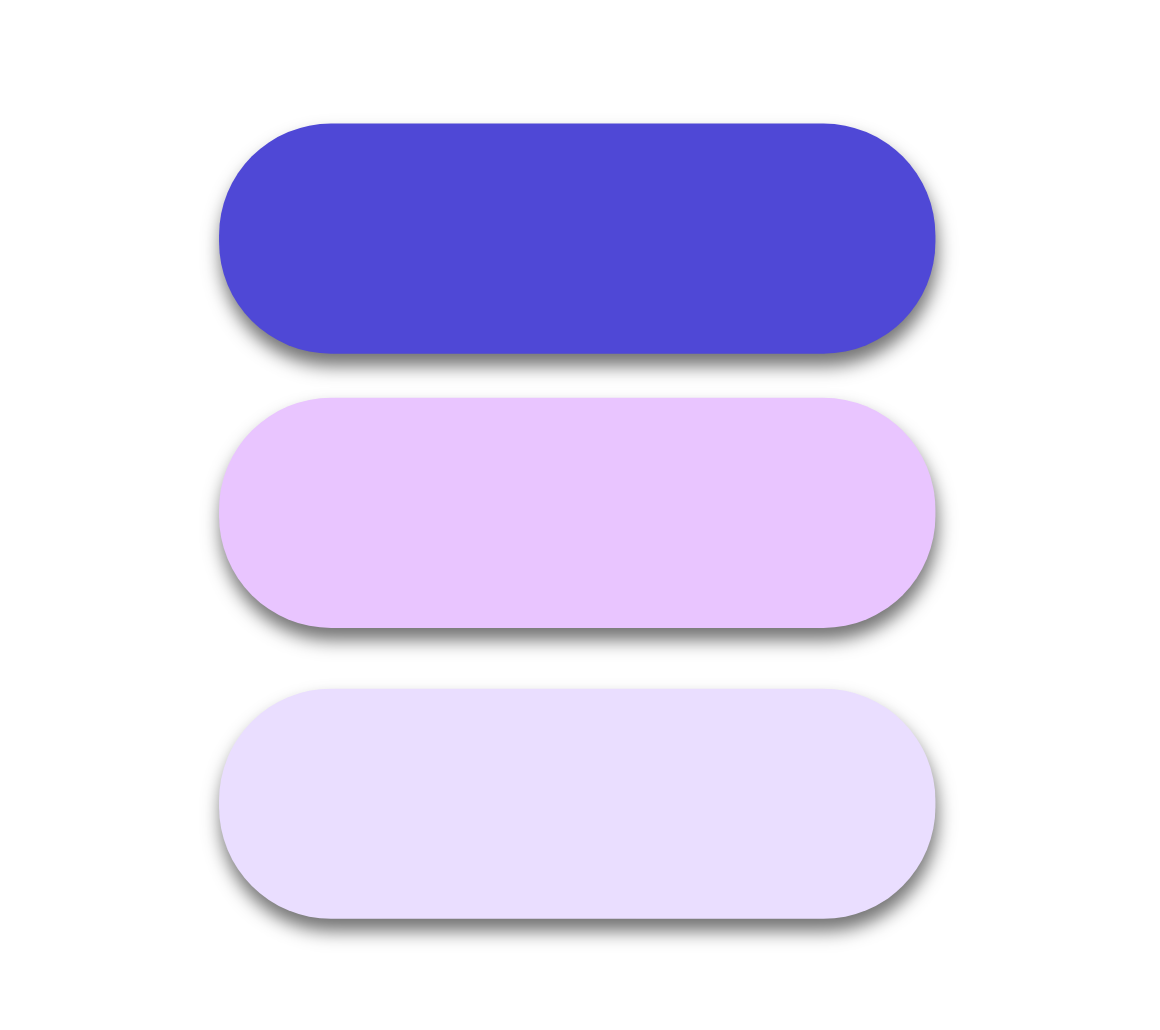
When designing your course, it’s best to use soft and subdued backgrounds and darker colours for the text. It is never a good idea to add too many colours to a course; three are usually more than enough to retain simplicity while making the course appealing to learners. Resources on the web can help you create the right colour palette for your course.
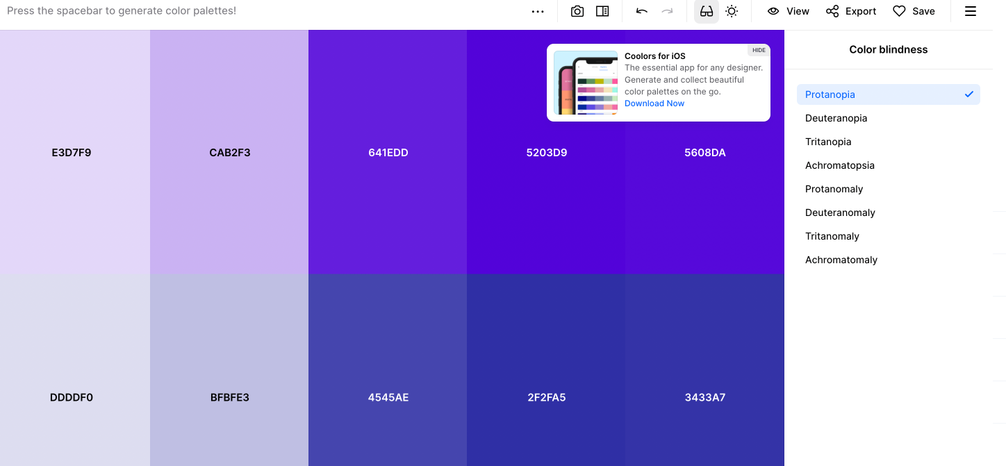
We recommend the online tool Coolors, which can help you pick a colour scheme for your learning course. This tool considers conditions such as colour blindness and levels of eyesight.

Tip #6 Consistency is key
It is common for people who don’t have enough design experience to create courses with colour or pattern themes that don’t match one another. Varying design elements across a course make it difficult for learners to adjust to theme changes every few slides, and they lose focus. In this case, consistency is crucial for learners to remain engaged; stick to a single colour palette and guide learners through learning content using focal points throughout the course content to enhance consistency and improve course navigation.
Course designers should also consider other design elements, such as fonts, backgrounds, and language.
To motivate learners to complete the course, the entire look and feel of the course must be captivating and exciting.
Learn how Loree can help you design engaging and interactive learning experiences with zero code experience required. Take your eLearning courses to new heights, today!
